
A finished painting can look certain. The subject appears to belong exactly where it is, the colours seem to have always known one another, and the final image feels settled.
The process of making it is much less certain.
Behind every completed painting are decisions that viewers may never notice: where to leave space, which colour to quieten, which edge to soften, what detail to remove, and when to stop. Some decisions happen before paint reaches the canvas. Others emerge only after I have spent days or weeks looking at the work.
In Insider Peek 12, I explored how a painting grows from a felt sense into its first marks. This next stage is about what happens after the beginning, when possibility must gradually become a coherent painting.
What decisions shape a finished painting?
The most important decisions behind a finished painting usually involve composition, focal point, colour relationships, value, edges, level of detail, symbolism, texture, and restraint. An artist repeatedly asks what the painting is about, where the viewer should look, what can remain quiet, and whether each new mark strengthens or distracts from the whole.
In my own work, these choices change with the subject. A koi painting needs the feeling of movement through water. A cat portrait depends on expression and presence. A seascape may need enough open space for the viewer to breathe. A symbolic work such as Caged and Uncaged asks the composition to carry an idea as well as an image.
There is no single formula. The decisions are guided by what each painting needs to communicate.
Deciding what the painting is really about
A subject is not the same as a painting’s meaning.
I may begin with koi, birds, cats, flowers, a landscape, or an imagined world, but the visible subject is only the starting point. Underneath it may be a question about freedom, resilience, companionship, serenity, transformation, or our relationship with nature.
This distinction affects every later decision.
In Tranquil Depth, the koi and lily pads create the visible world of the painting. Yet the deeper attention is on serenity, balance, resilience, and life’s changing flow. If I treated the work only as an exercise in accurately painting fish and leaves, I could include a great deal of detail and still miss its emotional centre.

Caged and Uncaged begins with birds, but its central tension is between security and freedom. The protected bird has comfort but limitation; the uncaged bird has possibility but also uncertainty. The painting depends on that contrast. The arrangement of space is therefore part of the meaning rather than merely a background for the birds.

Before resolving a painting, I need to know which experience should remain after the viewer has taken in the subject. That answer becomes a filter. It helps me decide what deserves emphasis and what can be allowed to recede.
Composition: choosing where the eye travels
Composition is the organisation of everything inside the frame. It determines where the eye enters, where it pauses, and how it moves through the image.
This can involve obvious choices, such as the position of the main subject, but it also includes intervals between forms, repeated directions, areas of contrast, and the balance between activity and rest.
In a koi painting, the bodies of the fish can create circular or diagonal movement. Lily pads can interrupt that movement, provide rhythm, or hold quieter areas of green around brighter orange and white forms. The fish do not need to face in the same direction. Their individual paths can lead the eye through the pond while still belonging to one larger flow.
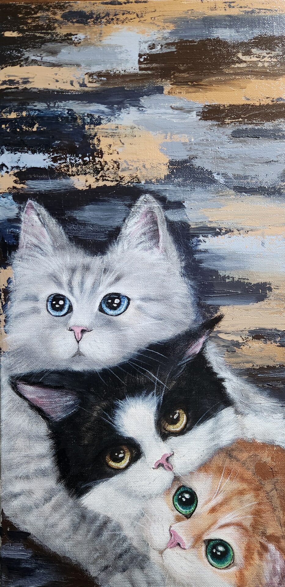
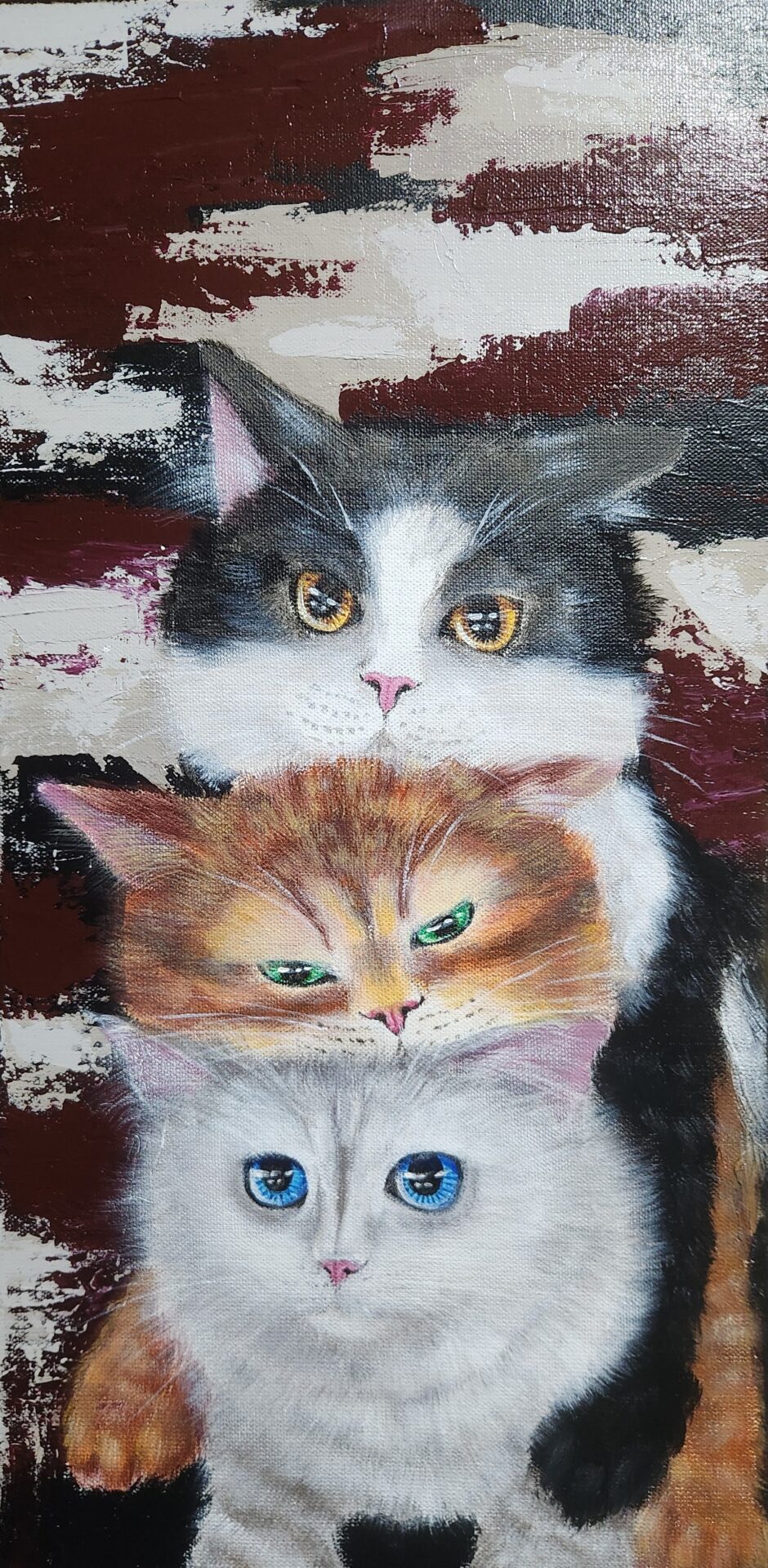
Animal paintings ask different compositional questions. In a close portrait, the placement of the eyes may carry most of the emotional weight. In a work showing several cats together, the overlap of bodies can express comfort, trust, curiosity, or comic tension before the viewer notices any individual detail.
My cat works, including Mochi Cats I, Mochi Cat II, and the Whiskers and Wonders pieces, often depend on closeness. Faces and bodies gather into compact arrangements. This gives the composition an immediate warmth because physical proximity becomes part of the story.
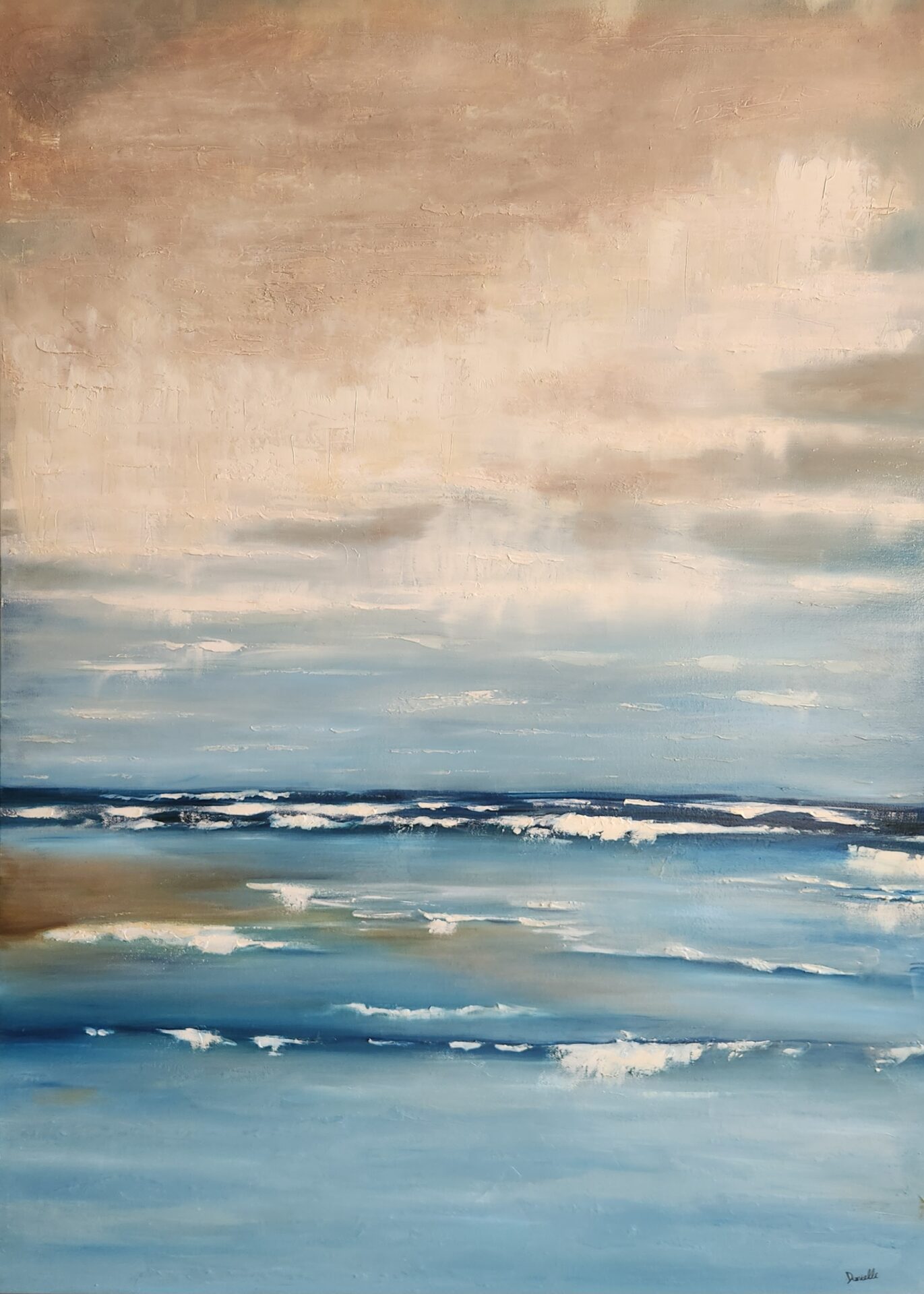
By contrast, a painting such as Serene uses the openness where sea meets sky. The horizon and surrounding space are not empty areas waiting to be filled. They create the pause. If too many objects or dramatic details were added, the painting would lose the quiet it is meant to offer.
Composition is therefore not about making every part equally interesting. It is about creating a visual path that supports the painting’s central feeling.
Focal point: deciding what speaks first
Every element cannot have the same volume.
When every feather, leaf, reflection, and background shape receives equal contrast and sharpness, the viewer has no clear place to begin. A painting may contain many beautiful parts yet feel visually noisy.
The focal point is the area that speaks first. It may be established through the strongest light-dark contrast, the sharpest edge, the richest colour, a recognisable face, or an interruption in a repeated pattern.
In an animal portrait, the eyes are often important, but this does not mean they must be exaggerated. A small highlight, an accurate direction of gaze, and the relationship between the eyes and surrounding facial structure can be enough to create presence.
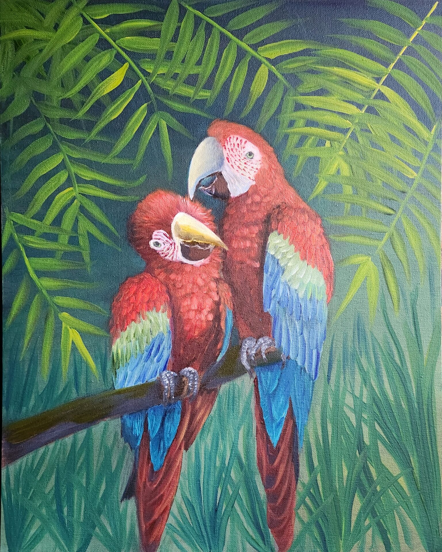
In Lovey Dovey, the red macaws are visually powerful because of their colour, but the emotional focus lies in their tender interaction. Their gesture toward one another carries the idea of companionship and care. The focal point is therefore not simply “red birds.” It is the relationship between them.
Once I know what should speak first, other areas can support it. Supporting does not mean unimportant. A quieter background colour, softer foliage, or less-defined edge can make the focal area more alive.
Colour: building relationships rather than choosing favourites
Colour is one of the strongest emotional languages in my work. It can create joy, tenderness, calm, mystery, heat, distance, or movement before the viewer has consciously interpreted the subject.
But colour does not work alone. Every colour changes according to what surrounds it.
The orange and white koi in Tranquil Depth become more luminous against the greens of the lily pads and water. The effect depends on the relationship between warm and cool notes, bright and muted passages, and small accents against larger colour fields.
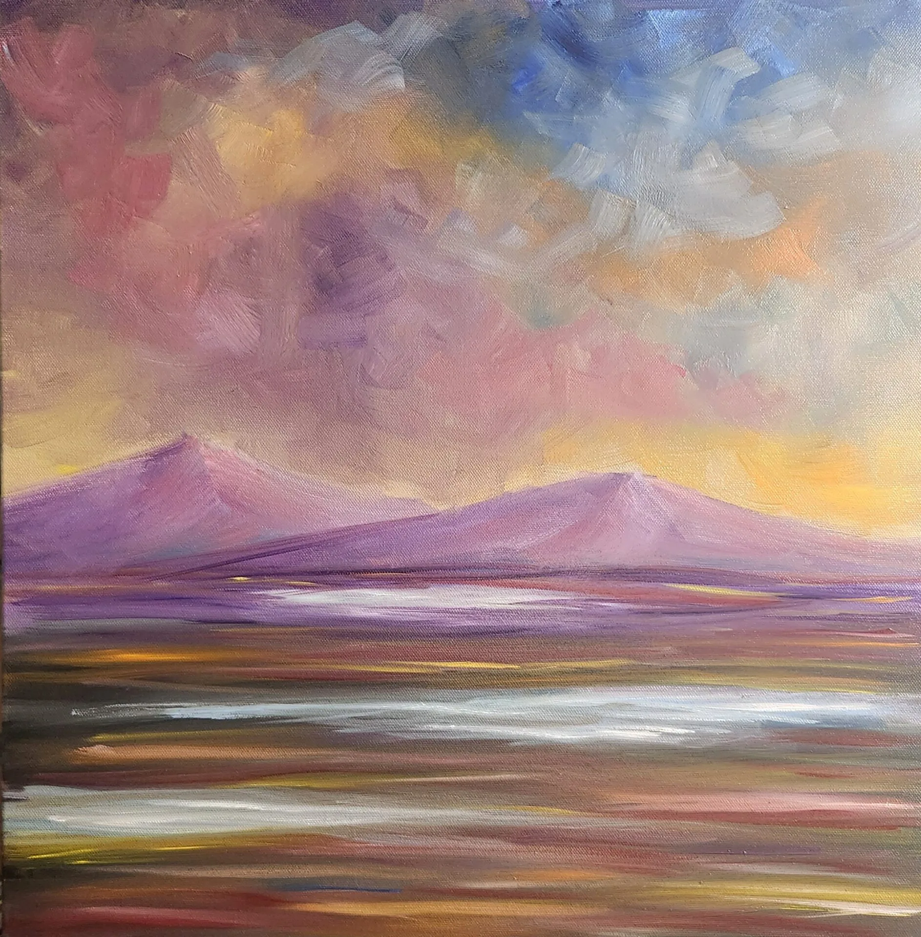
In Whispers of Dusk, purples, golds, pinks, and blues describe twilight, but their purpose is not only to copy the sky. They create the emotional transition of dusk: the moment when daylight is leaving but darkness has not fully arrived.

Vibrant colour can be joyful, but too much saturation everywhere weakens its impact. A bright note becomes stronger when it is surrounded by colours that allow it to breathe. Sometimes the necessary decision is not to make the focal colour brighter, but to quieten what competes with it.
I also look for colours that can travel through the painting. A small amount of a background colour may appear in the subject’s shadows. A warm note may be repeated at different intensities. These subtle connections prevent the painting from feeling like separate objects placed beside one another.
Value: the structure beneath colour
Value means how light or dark something is. It is less immediately seductive than colour, but it holds much of the painting’s structure.
Two colours can look very different in hue while having almost the same value. If too many important forms share similar values, they may merge when I want clarity. The opposite can also happen: excessive contrast can make every area compete.
I sometimes look at a painting from a distance or view a photograph of it in grayscale. This makes it easier to see whether the large light and dark shapes are working. Details disappear, and the underlying organisation becomes more obvious.
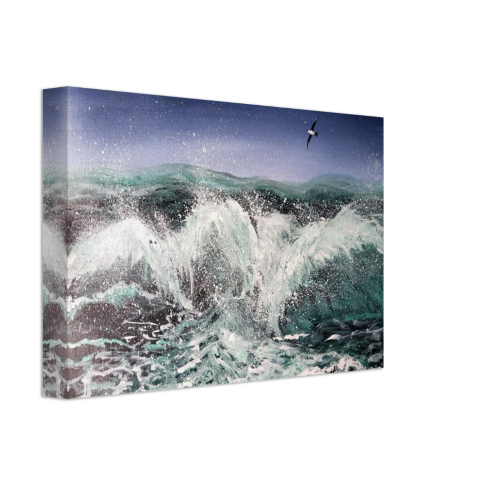
A calm work may use closer values to encourage a slower gaze. A dramatic seascape such as Tempest can support stronger contrasts because the subject is the ocean’s force, movement, and unpredictability.
The decision is not whether contrast is good or bad. It is whether the degree of contrast belongs to the emotional world of the painting.
Edges: deciding what is clear and what can dissolve
An edge is where one form meets another. It can be sharp, soft, broken, or almost lost.
Sharp edges attract attention and can make a form feel immediate. Soft edges allow shapes to share atmosphere. Lost edges invite the viewer to complete what is only partly described.
Nature rarely presents every contour with equal clarity. Water interrupts forms through reflection. Fur softens an animal’s outline. Leaves overlap, turn, and disappear into shadow. Clouds dissolve into surrounding light.
In koi paintings, varied edges help the fish feel submerged rather than placed on top of a flat blue or green surface. One part of the body may be clearly visible while another passes beneath reflected light or darker water.
In animal portraits, a precise eye or muzzle can be balanced by softer fur and background transitions. If every strand is equally sharp, the painting may lose the feeling of a living subject and become an inventory of details.
Edge control is one of the quietest decisions in painting because viewers may not identify it consciously. They simply experience that one area feels near, another distant, and another gently connected to its surroundings.
Detail: choosing what the viewer needs
I enjoy detail. The markings of a bird, the scales of a koi, the texture of fur, and the small structures of flowers can all be absorbing to paint.
Detail, however, must have a role.
If I describe everything equally, the painting can lose hierarchy and energy. The viewer is given information but no guidance. A few well-chosen details can suggest many more, especially when the larger shapes and gestures are already convincing.
This matters in works that combine realism with imaginative settings. The animals in Little Critters’ Daydream can feel believable while existing in a world shaped by wonder and quiet. Realistic observation gives them presence; selective simplification leaves room for the dream.
The same principle applies to landscape. A field does not require every blade of grass. A tree does not require every leaf. What matters is the rhythm, direction, density, light, and character that make the place feel alive.
Detail is most effective when it rewards a closer look without being necessary for the painting to work from across the room.
Symbolism: allowing the image to carry more than one meaning
Animals and nature often hold symbolic associations, but symbolism works best when it grows from the painting rather than being attached afterward.
Koi can suggest perseverance and the flow of life. Birds can embody freedom, vision, care, or confinement. Butterflies can represent transformation. Flowers can hold fragility, renewal, abundance, or remembrance.
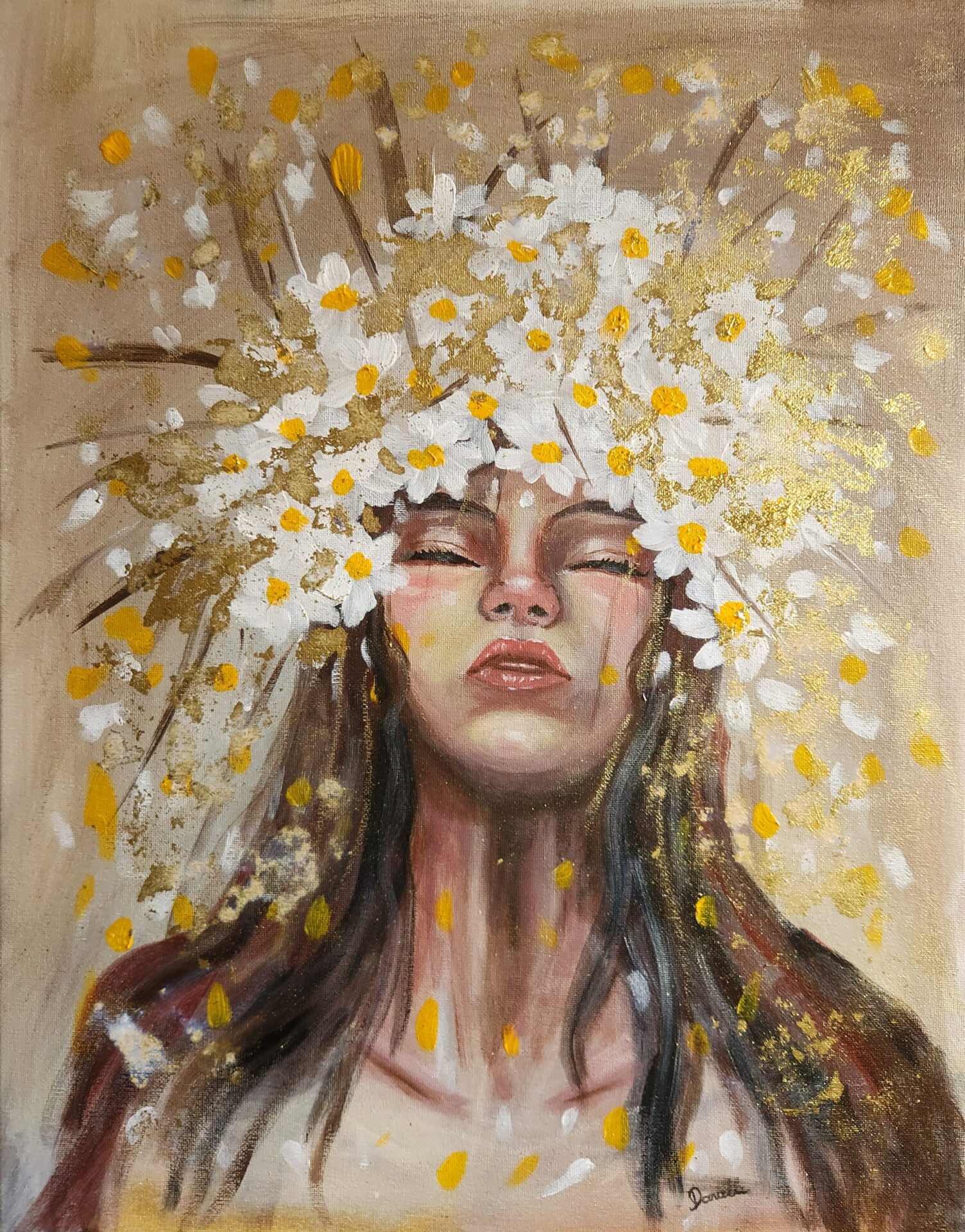
In Caged and Uncaged, the symbolism is built into the visual contrast. In Freedom in Bloom, the serene figure, daisies, light, and golden accents support ideas of growth, confidence, joy, and inner harmony.
The viewer does not have to interpret a symbol exactly as I do. A painting can begin with my intention and still make room for personal meaning. The aim is not to turn every image into a puzzle with one correct answer. It is to create enough emotional and visual coherence that deeper readings feel supported.
Texture: leaving evidence of the making
Paint is physical. A brushstroke has direction, pressure, speed, opacity, and texture. Even in a realistic image, I want the surface to retain some evidence of how it was made.
A translucent layer can create depth in water or sky. A dry brush can suggest fur, bark, or broken light. Thicker paint can bring attention forward. A scraped passage may reveal an earlier colour and give the surface history.
If every area receives the same finish, the painting can become visually flat. Variation creates rhythm. Smooth passages give active texture somewhere to matter; textured passages make the quieter areas feel intentional.
This is also where control and accident meet. Paint may drip, skip across the surface, or mix differently from what I expected. I decide whether that event belongs. Not every accident is valuable, but not every unexpected mark should be corrected.
Sometimes the painting becomes more alive when I allow the material to speak.
The difficult decision to remove
Adding is easier to recognise as progress. Removing can feel like going backward.
Yet some of the most important studio decisions involve covering a detailed passage, simplifying a background, reducing a colour, or taking out an element that no longer serves the painting.
Time spent on an area does not guarantee that it belongs. A beautifully painted flower can still distract from the main subject. A dramatic patch of colour can still disrupt a calm composition. A detail from the first version can remain after the rest of the painting has changed around it.
I try to ask a direct question: am I keeping this because the painting needs it, or because I worked hard on it?
The covered passage is not wasted. It taught me something about the image and may continue to influence the layers above it. A finished painting contains many decisions that are no longer visible.
Knowing when to pause
Not every problem can be solved by adding more paint.
After looking at a work for a long time, I can begin to see my intentions instead of what is actually on the canvas. A pause restores some distance. When I return, the first glance often reveals whether the composition feels heavy, whether one colour is too insistent, or whether the focal point lacks clarity.
Photographing the work can help because the smaller image reveals the overall structure. Turning it toward a wall for a few days can be even more useful.
Pausing is not inactivity. It is part of seeing.
This is particularly important when I feel the urge to refine every remaining area simply because the painting is close to completion. More detail can create the appearance of progress while weakening the original feeling.
How do I know when a painting is finished?
A painting is finished when its essential relationships feel resolved and further changes are more likely to make it different rather than better.
I look for a sense of stability. The focal point is clear without being forced. The quieter areas support it. Colour and value belong to the same world. The painting can hold attention without repeatedly asking to be fixed.
I also return to the original intention. Does the calm, movement, tenderness, freedom, wonder, or tension that began the work still remain? Technical refinement is useful only if it supports that experience.
Completion does not mean that every section contains maximum information. Often the final decisions involve restraint: soften one edge, reduce one contrast, connect two colours, or leave one area alone.
Then the painting moves into another life. In a home, exhibition, or collection, it will meet different light and different memories. Viewers will bring their own experiences to it.
The quiet studio decisions remain inside the work, even when they are no longer visible.
Frequently asked questions about finishing a painting
What makes a painting look finished?
A painting usually looks finished when its composition, focal point, values, colours, edges, and level of detail feel intentional and connected. Every area does not need equal detail. The important question is whether the visual relationships support the work’s central idea.
Why do artists paint over completed details?
Artists remove or cover details when those passages compete with the focal point, disrupt the composition, or no longer suit the direction of the work. The quality of an individual passage matters less than its contribution to the whole painting.
How does an artist choose a focal point?
A focal point can be created through contrast, colour, sharp edges, placement, recognisable features, or meaningful gesture. Artists decide what the viewer should encounter first, then make surrounding areas quieter enough to support that emphasis.
Can a detailed painting still feel calm?
Yes. Calm depends on organisation, not simply on the amount of detail. Repeated rhythms, harmonious colour, controlled contrast, open space, and a clear visual hierarchy can allow detailed work to remain peaceful.
How do you avoid overworking a painting?
Step back frequently, photograph the work, pause before making late changes, and return to the original intention. If a proposed addition does not improve the composition, focal point, atmosphere, or meaning, it may not be necessary.
The finished work and the invisible process
When a painting is finally seen on a wall, it no longer shows the sequence in which it was made. The viewer sees one image rather than the many versions hidden beneath it.
That is part of painting’s quiet mystery.
The work may appear still, but it contains movement: the first idea, the changed composition, the mixed colours, the softened edge, the removed detail, the pause, and the final decision to stop.
Across my paintings of koi, birds, cats, wildlife, flowers, imagined worlds, and open landscapes, the subjects change. The underlying attention remains: to celebrate life, to make room for connection, and to find moments of beauty, freedom, tenderness, resilience, and calm.
A finished painting is not the result of one dramatic choice. It is built from many quiet decisions, each asking the same question:
What does this painting need in order to become fully itself?
Leave a Reply