
Colour Becomes a Voice Before It Becomes a Formula
When people look at a painting, colour is often the first thing they feel and the last thing they try to explain. A blue can appear peaceful in one work and lonely in another. Pink may feel tender, playful, artificial or defiant. Gold can suggest sunlight, abundance, memory or a small flash of hope. The pigments may have familiar names, but their meaning changes according to the colours beside them, the forms carrying them and the emotional temperature of the painting.
This is why I think of colour as a language rather than a fixed system.
An artist’s personal colour language is the distinctive way they use colour to create mood, movement, emphasis and meaning. It is not simply a favourite palette. It includes the relationships an artist repeatedly builds: the colours that are allowed to dominate, the ones held back, the contrasts that create energy and the quieter tones that give the eye somewhere to rest.
Like any language, it develops through use. It grows through observation, intuition, experiments that succeed, combinations that fail, and decisions made so often that they eventually become part of the artist’s visual voice.
I did not sit down one day and design a colour language for my paintings. It emerged gradually across different subjects and bodies of work. Sometimes the palette began with what I saw in nature. Sometimes it began with a feeling I wanted to preserve. At other times, one unexpected colour changed the direction of the entire painting.
Looking back across my work, I can see recurring attractions: jewel-like blues and greens, warm flashes of gold, soft atmospheric purples, vivid botanical colour, and surprising touches of pink. These colours do not always perform the same role. Their meaning shifts, but their reappearance creates a thread between paintings that may otherwise seem very different.
What Is a Personal Colour Language in Art?
A personal colour language is the consistent emotional and visual logic behind an artist’s colour choices. It can be recognised through several elements:
- recurring colour families;
- characteristic contrasts;
- a preference for brightness, softness or tonal depth;
- the use of colour to direct attention;
- emotional associations attached to particular hues;
- and the balance between harmony and disruption.
This does not mean every painting must look alike. A visual language should be flexible enough to describe many experiences. We do not use exactly the same words in every conversation, yet our manner of speaking remains recognisable. In the same way, an artist may move from animals to landscapes, portraits or abstraction while retaining an identifiable sensitivity to colour.
The strongest colour language is not created by chasing consistency. It develops when an artist pays close attention to what genuinely moves them.
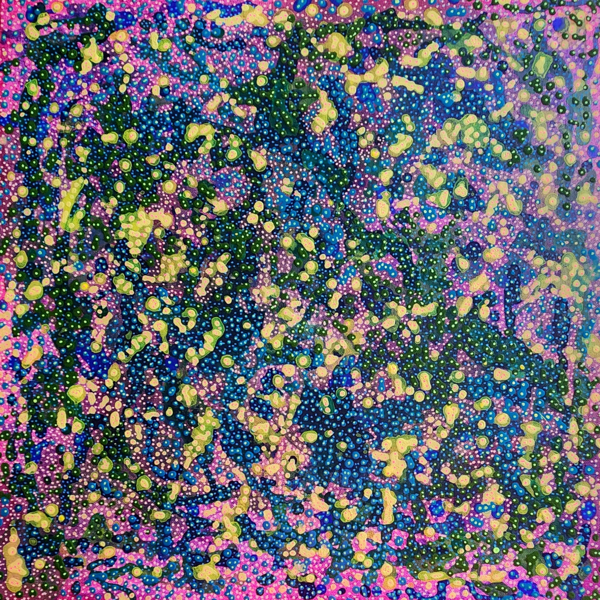
Beginning with Instinct: Atomic Nature 4
In abstract painting, colour often arrives before a clear narrative. It can lead the eye, suggest scale and create associations without depicting a recognisable scene.

In Atomic Nature 4, blue, green, yellow and pink gather in cellular and amoebic forms. The painting can suggest something seen through a microscope, a distant imagined universe, or a landscape that exists somewhere between the two.
The colour is deliberately active. Bold hues sit beside delicate dot details and layered organic shapes. No single interpretation needs to take control. Instead, the palette creates curiosity. It encourages the viewer to move closer, follow the patterns and allow associations to form.
This work represents one important part of developing a personal colour language: trusting attraction before explanation.
Artists are often encouraged to justify every decision, but colour does not always begin as an intellectual argument. Sometimes a particular green simply needs a warmer yellow beside it. A pink arrives because the composition feels too predictable. A deep blue creates the space that allows the brighter marks to breathe.
Instinct is not the absence of knowledge. It is knowledge that has become responsive. Years of looking, mixing and adjusting colours begin to operate beneath conscious thought. The hand recognises a relationship before the mind has found words for it.
For someone trying to develop a personal palette, these instinctive decisions are valuable evidence. Notice the colours you repeatedly reach for when nobody has told you what the painting should look like. Those choices may be the earliest vocabulary of your own visual language.
Colour as Presence: Birds of Paradise 4 – Peacock
Colour can create atmosphere, but it can also give a subject an unmistakable presence.
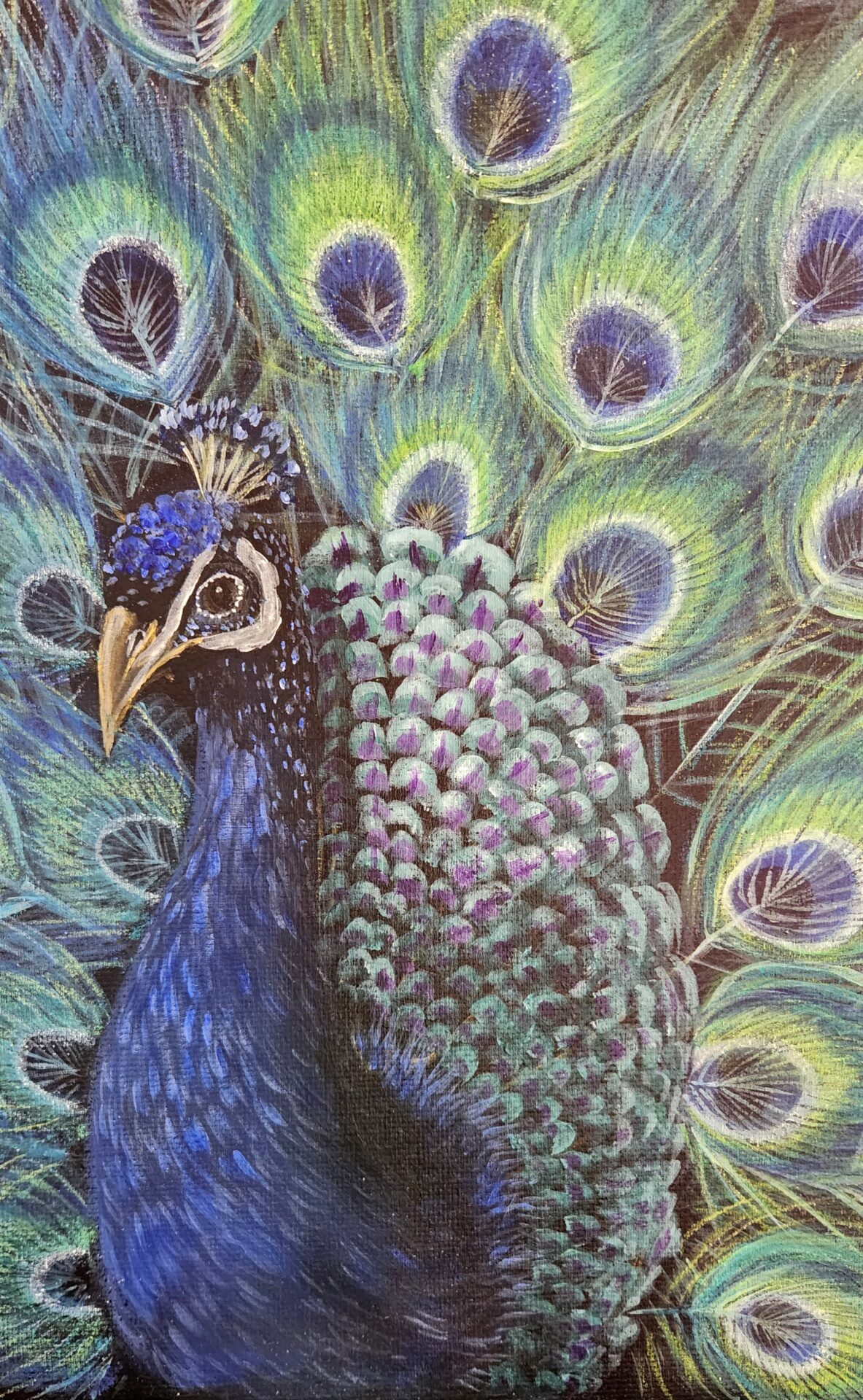
In Birds of Paradise 4 – Peacock, the peacock’s feathers offer a natural lesson in layered colour. Blues and greens do not behave as flat, separate blocks. They shimmer, overlap and change according to the colours around them, producing the impression of iridescence.
Here, colour is not merely describing the bird. It communicates elegance, confidence and self-expression.
Painting such a subject requires more than choosing the brightest blue or green available. The sense of radiance depends on variation. Deep tones provide structure, mid-tones connect the feather patterns, and smaller highlights create the sensation of light moving across the surface.
This side of colour language develops through close observation. A feather is not simply blue. It may contain turquoise, violet, green, near-black and a small reflected warmth. Every hue is altered by texture, direction and neighbouring colour.
The painting also demonstrates the value of controlled intensity. If every passage is equally bright, no part feels truly luminous. Darker passages and quieter transitions allow selected colours to appear more brilliant. The eye reads the contrast as shimmer.
Restraint is therefore not the opposite of vibrancy. It is what gives vibrant colour its power.
Colour as Symbol: Metamorphosis
Colour can also carry symbolic and emotional meaning, especially when repeated forms create a visual story.

In Metamorphosis, vibrant butterflies move across a textured background. Their colour helps separate them from the surface while connecting them to one another, turning repeated natural forms into a meditation on transformation, resilience and the beauty of change.
The emotional meaning does not come from one hue in isolation. It comes from the relationship between the lively butterflies and the more complex ground beneath them. Colour creates emergence. The forms appear to lift away from heaviness and move towards possibility.
Symbolic colour is most convincing when it is felt rather than imposed. If a painter decides that yellow must always mean happiness or blue must always mean sadness, the result can become simplistic. Human emotions are rarely so tidy. Warm colours can feel comforting or overwhelming. Cool colours can communicate peace, distance, freedom or grief.
A personal colour language becomes richer when the artist allows these meanings to remain layered.
Butterflies already carry familiar associations, but the palette determines how those associations feel within a particular work. They may appear delicate, energetic, hopeful or newly released. Texture prevents the symbolism from becoming too polished; change is presented as something that arises through complexity rather than outside it.
This is another way an artist’s palette becomes personal: colours and motifs begin to gather memories from earlier works. A bright accent is no longer only decorative. It carries the history of every place it has previously represented movement, courage or emergence.
Colour as an Ecosystem: Coral Symphony 2
Nature rarely presents colour as a neat row of separate swatches. It layers hues, repeats them at different scales and places unexpected colours beside one another.
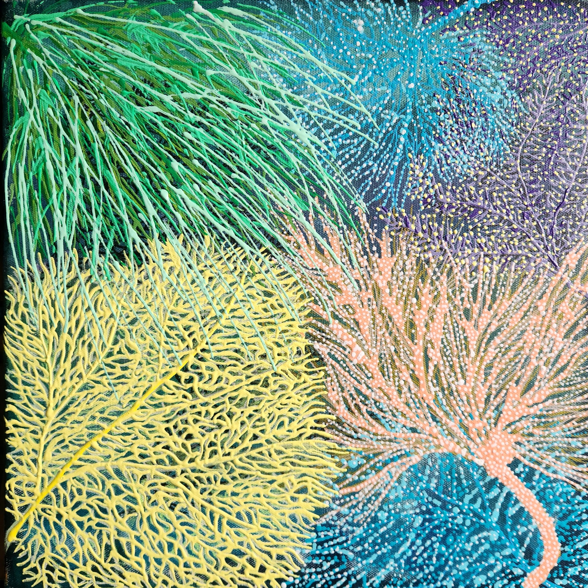
Coral Symphony 2 draws from botanical forms and coral reef life. Green, yellow, pink, blue and purple flow through layered textures and mixed-media details. The painting does not copy one particular reef. It responds to nature’s abundance and its ability to make complexity feel coherent.
This kind of palette is built through orchestration. Each colour needs enough independence to be noticed, yet every part must still belong to the whole.
Repetition helps. A pink that appears in one corner can reappear as a smaller accent elsewhere. A dominant green may shift from cool to warm across the surface. Blue can move behind other colours, creating visual depth. The palette begins to behave like an ecosystem in which every element affects its neighbours.
For artists, this is a useful alternative to choosing colours one by one. Instead of asking whether a particular colour is beautiful, ask what role it plays. Does it connect two areas? Create a pause? Increase depth? Add tension? Echo a form? Make another colour appear brighter?
Colour becomes language when it begins to perform these relationships.
Repetition Does Not Mean Repeating the Same Painting
Developing a recognisable palette can create anxiety. Artists may worry that repeating colours will make the work predictable, while changing direction may make the body of work feel inconsistent.
The solution is not to force sameness. It is to understand what lies beneath the repetition.
Across Atomic Nature 4, Birds of Paradise 4 – Peacock, Metamorphosis and Coral Symphony 2, the subjects and moods are different. One is an energetic abstract world. One studies the radiant presence of a bird. One explores transformation through butterflies. One celebrates the complexity of organic life.
Yet they share certain sensibilities: colour is layered rather than flat; nature is a recurring source; bright hues are balanced by areas of calm; and warmth often appears as a point of emotional emphasis.
That underlying logic creates coherence without requiring a fixed palette.
An artist may return to blue many times because blue can hold enormous emotional range. What matters is not merely that blue reappears, but how it is used. Is it a field, a shadow, a current, a sky, a fragment or a silence? Repetition becomes meaningful when each painting asks the colour a different question.
How Artists Can Develop Their Own Colour Language
There is no single exercise that produces an authentic palette, but several habits can make your preferences easier to recognise.
1. Collect Colour Experiences, Not Only Colour Swatches
Keep records of colour encountered in daily life: fading evening light, food arranged on a plate, leaves after rain, packaging, fabric, old walls, flowers or reflections in water. Note why a combination held your attention.
The emotional context matters. A palette remembered from a meaningful place will often carry more energy into a painting than a fashionable colour chart.
2. Review Several Finished Works Together
Place photographs of your paintings side by side. Look for colours and relationships that recur without deliberate planning. You may discover that you repeatedly pair cool grounds with warm focal points, soften strong colours with dusty neutrals, or use one surprising accent to interrupt harmony.
These patterns are more revealing than deciding what your signature colours ought to be.
3. Mix Beyond the Tube Colour
Personal colour often begins in mixing. A commercially prepared green belongs to everyone who buys it. The green you adjust with blue, ochre, pink or grey begins to carry your particular sensitivity.
Mixing also creates related colours. When several hues share small amounts of the same pigments, they are more likely to feel as though they inhabit the same world.
4. Let Neutrals Participate
Neutrals are not empty background colours. They control pace and intensity. A warm grey can make blue feel spacious. A muted green can calm a bright pink. Cream may feel softer than white, while near-black can give luminous colours greater depth.
The quieter members of a palette often determine whether the louder ones can be heard clearly.
5. Make Room for the Unexpected
A personal language should continue to grow. Introduce a colour you usually avoid, but give it a specific purpose. Change the proportion of familiar hues. Try allowing a former accent colour to dominate.
Unexpected choices prevent a visual language from becoming a formula. They also reveal which parts of your palette are essential and which were simply habits.
How Viewers Recognise an Artist Through Colour
Viewers may not consciously analyse palette structure, but they often recognise its effects. A group of paintings can feel connected before the reason becomes obvious. The connection may be a repeated glow, a preference for layered cool colours, a particular kind of contrast, or the way natural hues are pushed beyond realism.
This recognition is valuable because it creates a relationship between artworks. Someone drawn to the iridescent blues and greens of Birds of Paradise 4 – Peacock may recognise the same attention to layered natural colour elsewhere in the collection. A viewer who enjoys the vivid organic energy of Atomic Nature 4 may also respond to the reef-like abundance of Coral Symphony 2.
Internal connections help a collection feel like an unfolding conversation rather than a set of isolated objects.
For collectors, colour is also part of living with art. A painting changes with the light in a room and with the colours around it. Bright details may become more noticeable at certain times of day. Darker passages may create a feeling of depth. A palette that first attracts attention can later reveal subtler relationships through repeated viewing.
The Palette Is Still Evolving
I do not think a personal colour language is ever completely finished. Every new subject introduces different demands. Experience changes what we notice. A colour once avoided may suddenly become necessary, while an old favourite may need to be used more quietly.
The goal is not to arrive at a permanent collection of approved hues. It is to become more fluent in recognising what colour can do.
Colour can describe, but it can also remember. It can organise a complex surface, carry a symbol, establish atmosphere or create a point of emotional intensity. It can make a painting feel expansive, intimate, playful, contemplative or alive.
My own colour language continues to move between these possibilities. It is shaped by nature, by the emotional character of each subject and by the pleasure of discovering what happens when one colour meets another.
Perhaps that is why colour remains endlessly compelling. We may begin with pigment, but what we are really arranging is attention, memory and feeling.
The language becomes personal not when every painting uses the same colours, but when the choices begin to sound like your own voice.
Leave a Reply