

Insider Peek 20: Framing Choices That Respect the Artwork
Framing can look like a final practical step, but it is really another visual decision.
After a painting is finished, the frame becomes the edge between the artwork and the room. It protects the work, gives it structure, and affects how the viewer first meets it. A frame can make a painting feel quieter, warmer, more formal, more intimate, more contemporary or more grounded. It can also distract from the painting if it asks for too much attention.
This is why I think of framing as part of the artwork’s presentation, not just its packaging.
A good frame does not need to be expensive or elaborate. It needs to understand its role. It should support the painting, protect it appropriately, and help it belong in the space where it will live. Sometimes that means a simple natural wood frame. Sometimes it means clean white, narrow black, soft gold, a floating frame, a mat, or no frame at all if the work is designed to be shown that way.
The question is not, “Which frame looks impressive?”
The better question is, “What helps the painting speak clearly?”
The Frame Is a Boundary, Not the Main Subject
A frame creates a boundary. It tells the eye where the painting begins and ends. This sounds simple, but boundaries are powerful. They can give an artwork presence on the wall, especially when the surrounding room is busy or when the painting needs a little visual breathing room.
But a boundary should not become the main subject.
If the frame is too heavy, glossy, ornate, dark or strongly coloured for the work, the viewer may notice the frame before the painting. Sometimes that can be appropriate for a historical or decorative context, but for many contemporary original paintings, the frame should feel more like a quiet support.
I often ask whether the frame is helping the artwork arrive or trying to perform beside it.
A painting already has its own internal world: colour, movement, texture, subject, light, atmosphere. The frame should respect that world. It can echo something in the painting, create a useful contrast, or give the work enough separation from the wall. But it should not flatten the painting into decor or turn the edge into the loudest part of the piece.
Restraint can be a very generous framing choice.
Let the Mood of the Painting Lead
Before choosing a frame, it helps to name the feeling of the artwork.
Is the painting calm, lively, luminous, intimate, playful, earthy, bold, nostalgic or spacious? Does it feel more natural or architectural? Does it need warmth or crispness? Is the subject delicate enough that a heavy frame would overwhelm it? Is the surface textured in a way that benefits from a little shadow around the edge?
These questions matter because a frame changes the emotional temperature of a painting.
A pale wood frame can make an artwork feel natural and relaxed. A black frame can create clarity, contrast and definition. White can feel light and clean, especially with works on paper or paintings that need air. Soft gold can add warmth without becoming too grand if the profile is restrained. A floating frame can let the artwork keep its object quality, showing the edge rather than hiding it.
There is no universal best choice. The right frame depends on the painting and the life it is entering.
A Clean Black Frame for Strong Colour
Some paintings can hold a stronger frame because the artwork itself has enough colour, shape and confidence to meet it.
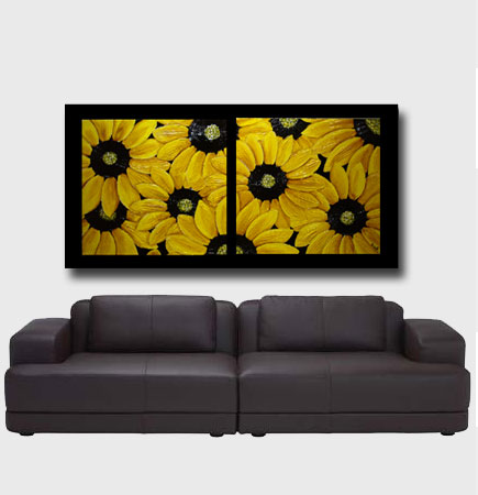
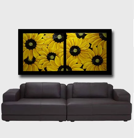
This sunflower display shows how a dark frame can create useful definition. The black edge gives the yellow petals and warm wall colour a clearer boundary, while the simple profile keeps the frame from becoming too heavy.
For strong floral work, a darker frame can be helpful when the room already has warmth and texture. It gives the painting a confident edge, but the frame still has to stay quiet enough for the colour to remain the main event.
Colour: Echo, Contrast or Neutral Support
Frame colour does not have to match the painting exactly. In fact, exact matching can sometimes feel too controlled. A frame works best when it creates a relationship with the artwork.
There are three common ways to think about this relationship.
The first is echo. A warm wood frame may pick up ochre, gold, sand or earth tones in the painting. A soft white frame may echo pale highlights. A dark frame may repeat a deep shadow or line.
The second is contrast. A black frame around a luminous work can sharpen the image and help colours feel more intense. A natural wood frame around a cooler painting can introduce warmth. A light frame around a richly coloured painting can prevent the whole presentation from becoming too heavy.
The third is neutral support. Sometimes the best frame is the one that almost disappears. It gives structure without strongly announcing itself.
I like to consider all three before deciding. A painting may surprise me. What seems obvious at first may not be the most respectful choice once the frame sample sits beside the actual surface.
Scale and Profile Matter
The profile of a frame is its shape, width and depth. This can change the feeling of the artwork as much as colour does.
A narrow profile often feels contemporary, clean and quiet. It lets the painting remain central. A wider profile can give a small artwork more presence or help a larger work feel anchored. A deep floating frame can make a canvas feel more object-like, especially if the painted edges are part of its character.
But width should be chosen carefully. A small delicate painting can be overwhelmed by a heavy frame. A large energetic work may look under-supported by something too thin. A very textured painting may need enough depth so the frame does not feel visually flat beside it.
Scale is a relationship. The frame, painting, wall and room all affect one another.
This is why I prefer to see frame samples beside the artwork whenever possible. A frame that looks elegant on its own may behave differently next to a particular painting. The painting always has the final vote.
Framing a Series or Panel Work
Some artworks become more polished when the frame helps the separate parts read as one complete visual statement.

With a panel-style composition, the frame does more than decorate the edge. It gathers the separate parts so the eye understands them as a complete work. The orange tones stay joyful and fresh, while the black border gives the arrangement clarity.
This kind of framing suits a painting that already has strong graphic rhythm. The frame should sharpen the presentation without making the artwork feel boxed in.
Works on Paper Need Different Care
Framing is also about protection.
Works on paper usually need more careful framing than stretched canvas. Paper can be sensitive to moisture, handling, light and contact with unsuitable materials. A mat can keep the artwork away from the glass or acrylic. Acid-free materials help protect the paper over time. UV-protective glazing may be worth considering, especially if the work will hang in a brighter area.
The mat is not only practical. It also changes the way the artwork is seen. A wider mat can create quiet space around a small work. A narrow mat can feel more direct. White or off-white mats are common because they give breathing room without arguing with the artwork, but the exact tone still matters. A very cool white may feel harsh beside a warm painting. A warmer off-white may be kinder.
For original works on paper, I would rather choose careful materials and a simple frame than a dramatic frame that does not protect the work properly.
The frame should serve both the eye and the lifespan of the artwork.
When No Frame Is the Right Frame
Not every artwork needs a traditional frame.
Some stretched canvases are designed to be shown unframed, especially if the edges are painted, clean or intentionally part of the object. In a contemporary home, an unframed canvas can feel direct and fresh. It can also suit a more relaxed setting where the painting does not need a formal border.
But unframed does not mean unfinished. The edges still matter. The canvas depth, side finish, hanging hardware and wall placement all contribute to the presentation.
A painting without a frame often needs more breathing room around it, because there is no additional boundary separating it from the wall. The wall colour becomes part of the presentation. So does the lighting.
The decision should be made intentionally. If no frame allows the painting to feel more alive, then no frame can be the most respectful choice.
Letting the Room Support the Painting
Sometimes framing is not only about the edge of the artwork. It is also about how the framed painting sits with furniture, wall colour and nearby objects.
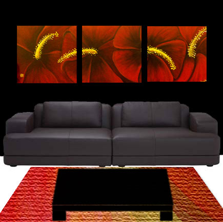
This floral wall display shows how a frame can help bright colour belong in a room. The surrounding furniture and wall colour echo the warmth of the painting, while the framed edge keeps the artwork visually contained.
For expressive botanical work, I would avoid a frame that competes with every petal and leaf. A simple frame allows the energy of the subject to remain alive while giving the whole piece enough structure to sit confidently in the home.
The Room Matters, But It Should Not Overrule the Painting
A frame has to live in a room, so the home matters. Flooring, wall colour, furniture, lighting and nearby objects can all affect the choice.
Still, I would be careful about letting the room overrule the artwork.
If a painting needs a quiet natural frame, forcing it into a glossy black frame only because other frames in the house are black may not serve the work. If a painting needs air, placing it in a heavy frame to match a piece of furniture may make it feel tired. Harmony is good, but obedience can flatten an artwork.
There are gentle ways to connect the frame to the home without losing the painting. Repeat a material rather than an exact colour. Choose a frame profile that suits the room’s architecture while keeping the finish simple. Let the artwork be the one element that brings a slightly different note.
A home does not need every frame to match. It needs the collection to feel considered.
Practical Details Collectors Should Notice
A beautiful frame still needs to be practical.
Check that the hanging hardware suits the weight of the artwork. Use proper wall hooks or anchors rather than temporary solutions for heavier pieces. Avoid hanging original art in direct sun, damp bathrooms, above strong heat sources or close to cooking steam. If using glass or acrylic, think about glare and reflection as well as protection.
If the artwork is valuable, sentimental or delicate, professional framing is often worth it. A good framer can advise on materials, spacing, matting, glazing and conservation choices. This is especially important for works on paper or pieces that will hang in challenging light.
The practical details may not be glamorous, but they are part of respecting the artwork.
A frame is not only what people see. It is also how the work is held.
A Frame Should Help the Artwork Arrive
When framing works well, it can feel almost inevitable.
The painting looks more settled. The room receives it more clearly. The eye understands where to enter. The work has presence without feeling dressed up. The frame is visible, but not demanding. It gives the artwork enough structure to meet the world outside the studio.
That is the quality I look for.
Not the most dramatic frame. Not the most expensive one. Not the one that announces taste the loudest. The one that lets the painting become more itself.
Framing is one of the last decisions around an artwork, but it can shape the first impression for years. It deserves patience, not panic. It deserves looking, testing, comparing and listening to the work.
A frame should protect the painting. It should help it belong. It should create a respectful edge between the artwork and the room.
Most of all, it should let the painting speak before the frame does.
Leave a Reply